This is a blog post about toggle controls. These are controls, like light switches, that have a binary movement. Light switches have a binary state, lights on or off, however toggles are also used to control settings that can have multiple states. For example, volume or temperature settings can be adjusted up or down with a toggle control.
We recently leased a brand-new car and the dashboard design changed quite a bit from the previous model. I was intrigued by the change in the design of the heating controls. A new type of toggle control to raise or lower the heat was used and its one that I’ve seen recently on a television remote.
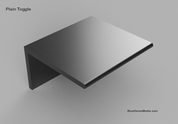
A sketch of this toggle control is shown below. The toggle was positioned in a row of similarly shaped controls below the dashboard. The aesthetic was very nice but I did not recognize immediately that I needed to push the toggle up or down to increase or decrease the car temperature respectively.

The toggle shape reminded me of buttons that used to appear on radios where the expected interaction was to push in to turn something on
and through a spring mechanism, push and then release the spring to turn the same setting off. I thought this perception may be related to appliances from the past and so particular to my experiences. However, a casual survey of college aged students showed the same lack of recognition about how to use the new controls.
Can This Toggle Be Made More Intuitive to Use?
The interaction with this toggle made me think about ways to make the desired use more recognizable. What I like about this type of interface is the control and consistency of the user experience. Each push up raises the temperature 1 degree and each push down lowers the temperature by the same 1 degree. It is easy to use, without looking, and yields very little friction.
The array of these controls was presented in a sleek, black container which resulted in a stylish, minimalist design. In coming up with ideas to increase the affordance of these controls, I did not want to diminish the aesthetics of the current design.
The following images show a few concepts I developed to achieve this goal.

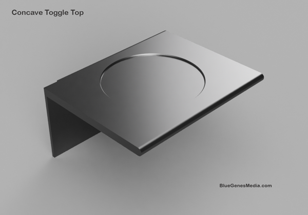
The “Concave Toggle Top” concept includes the addition of a depressed, circular area. I thought the illusion of a thumbprint might trigger someone to think that they should push down. A limitation of this design is it doesn’t have a parallel representation to push up; the user would have to infer that interaction.

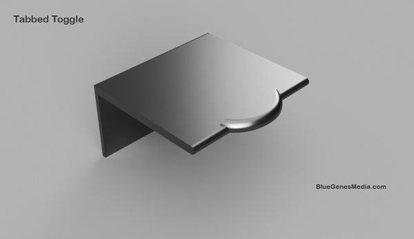
The “Tabbed Toggle” concept has a slight lip on the edge of the toggle. This represents both the upward and downward movement.

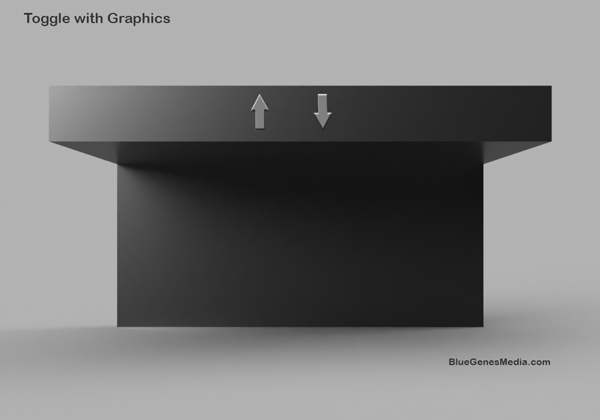
This final concept, “Toggle With Graphics”, has explicit symbols to indicate that the toggle moves up and down. The limitation of this design is that the toggles will be positioned in the car below eye level of the driver or passenger. The arrows would still be visible by looking down at the control. One compensation for this would be to make the arrows embossed so the driver could feel the shape of the symbol without having to look directly at the control.
Usability Research
The next step is to create suitable prototypes and run a usability test to get direct user feedback. There may be more concepts to try as well.
Molly
Comments are closed.